

Beachside: A Snack Shop
Responsive Website
A responsive website designed to assist humans with food allergies and dietary restrictions by hosting important ingredient information front and center.
Original design and process was taken from Beachside: A Snack Shop app. UI and branding has been adjusted.
My Design Process
-
Researching user needs.
-
Stating my users needs and problems.
-
Creating a lot of ideas and challenging assumptions.
-
Create solutions!
-
Testing my solutions and iterating on them.
Project Overview
The Problem
Busy people with food allergies need an easy way to view food information and order from their favorite snack shop online.
My Role
UX Designer
Conducting interviews, paper and digital wireframing, low and high-fidelity prototyping, conducting mock usability studies, accounting for accessibility, and iterating on designs.
Responsibilities
Empathize and Define
Initial Research into Users Needs
-
Conduct user interviews in order to better understand user needs and problems that users face in their daily lives around similar websites and apps.
-
Identify user pain points based on data from user interviews.
-
Create a persona to better understand the user their pain points.
User Research Summary
I conducted usability studies, created empathy maps, researched for a competitive audit, created personas, and much more. The main user group that was determined through my research we’re aged 18-70 and because of lack of time or inability had difficulty ordering via other apps with their food allergies.
The research confirmed original thoughts about intended customers but research also let us know that not only was time or frustration with other apps a factor but also convenience in being able to see allergens up front with this app.
User Research Pain Points

Time
The user group are sometimes too busy to call restaurants to check on food allergens and dietary restrictions.

Accessibility
Other sites may not have accessibility in mind. Users could struggle with the lack of accessibility options with other websites.

Interface
The interface of many websites was too busy for users to be able to comfortably use
Availability
Users sometimes have a hard time finding food they can eat.

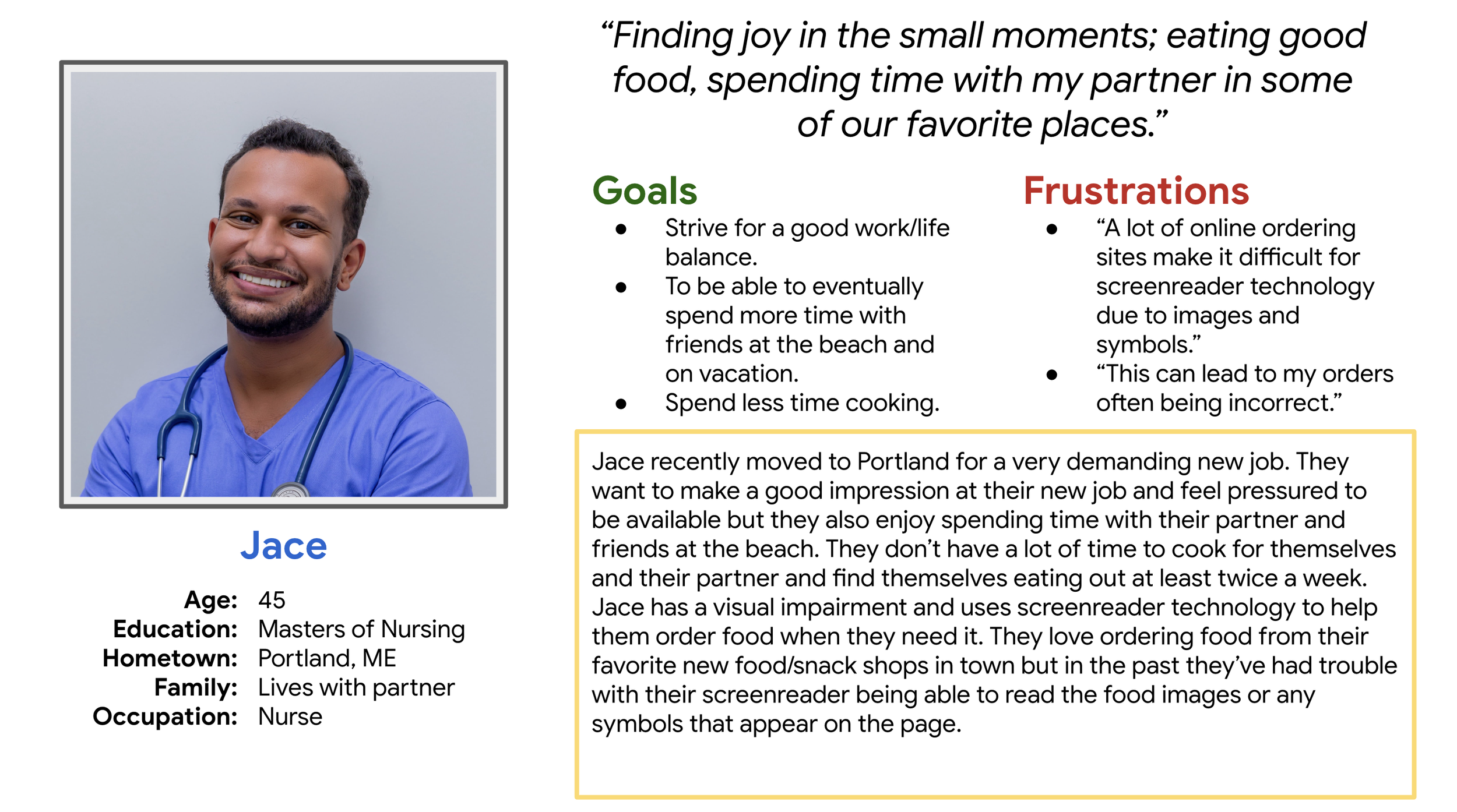
Persona: Jace
I created a persona for someone that embodied the user group that my app would be geared towards. I named them Jace!
Jace has a visual impairment and uses screenreader technology to help them order food when they need it. They love ordering food from their favorite new food/snack shops in town but in the past they’ve had trouble with their screenreader being able to read the food images or any symbols that appear on the page.
Ideate
Challenge assumptions and craft a solution!
The data I gathered from user interviews pointed to many users with allergies and dietary restrictions struggling with other snack shop and restaurant apps. There was a clear need for users to be able to see ingredients and allergens up front. This led to my proposed goal and solution…
-
Ideate on a proposed solution by creating paper wireframes
-
Take the paper wireframes to the next step by creating digital wireframes.
-
Create a sitemap to establish the information architecture of the website.
Solution
Design a responsive website that allows users to quickly and easily find the snack food they love by listing allergens up front.
Paper Wireframes
I ideated by creating paper wireframes of what the proposed website would look like. Going through Jace’s user journey helped me to understand how helpful it would be to have allergens listed clearly on a snack website for users.
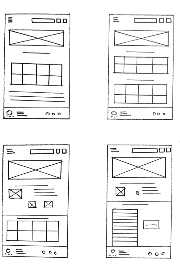
Digital Wireframes
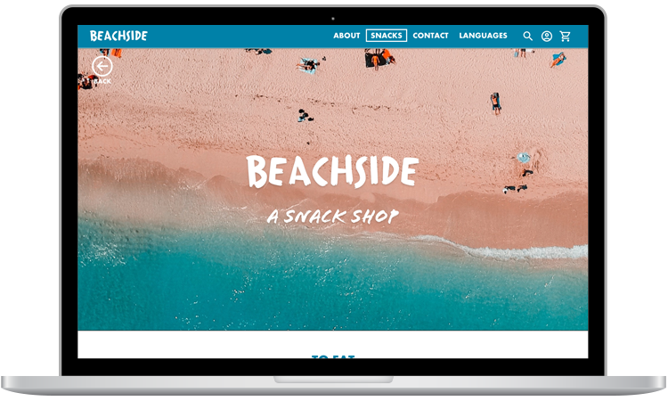
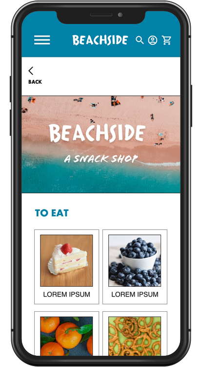
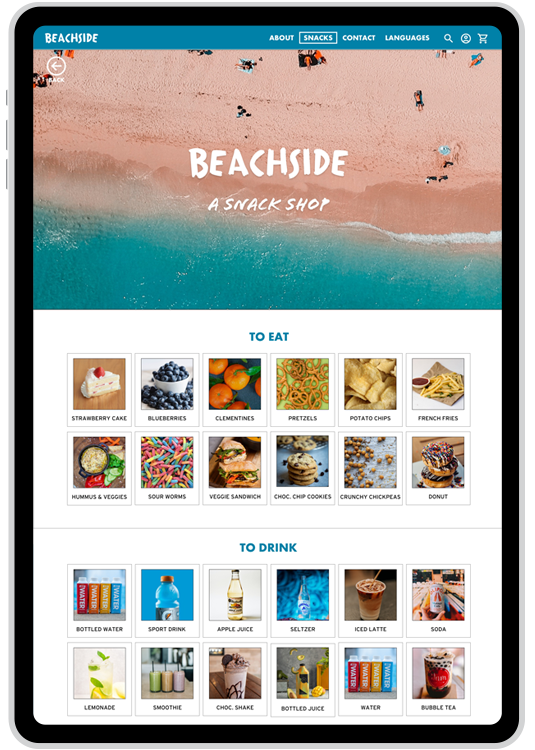
Responsive Web Design
Different screen sizes shown in these wireframe examples were created to portray responsive web design.
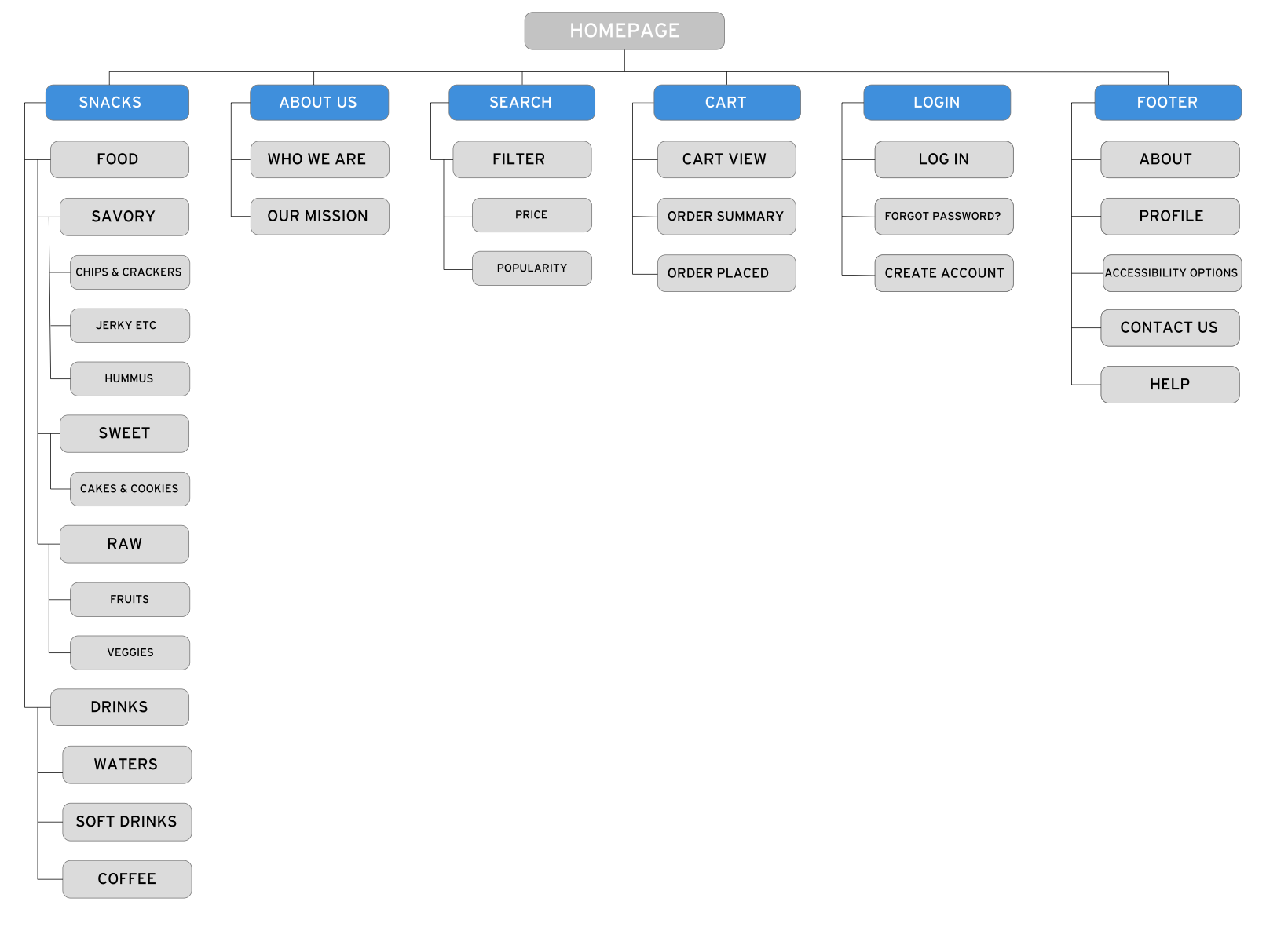
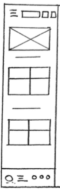
Site Map
I created a sitemap to establish the informational architecture of the website.
Prototype & Test
Create working prototypes of the digital wireframes and test the designs.
-
Create a low fidelity prototype from the digital wireframes.
-
Create a user journey map that leads the user through the workflow within the low fidelity prototype.
-
Conduct an unmoderated usability study in order to identify ways to improve the app.
-
Create mockups of the low fidelity prototype based on insights from the usability study.
-
Create a high fidelity prototype based on findings from the usability study and the mockups.
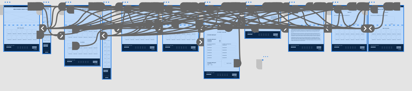
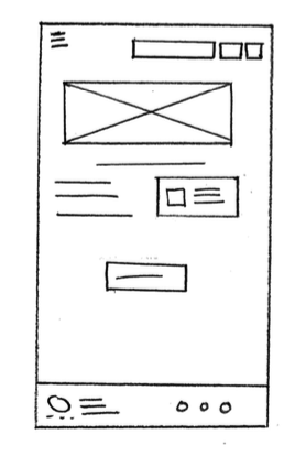
Low Fidelity Prototypes
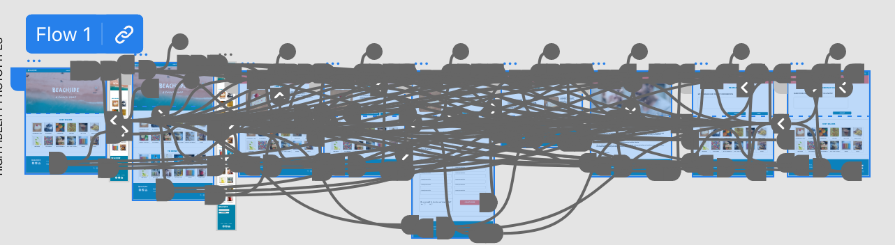
The Beachside Snack Shop low-fidelity prototype shows the primary user flow of the website I am building so that it could be used in a usability study with actual users.
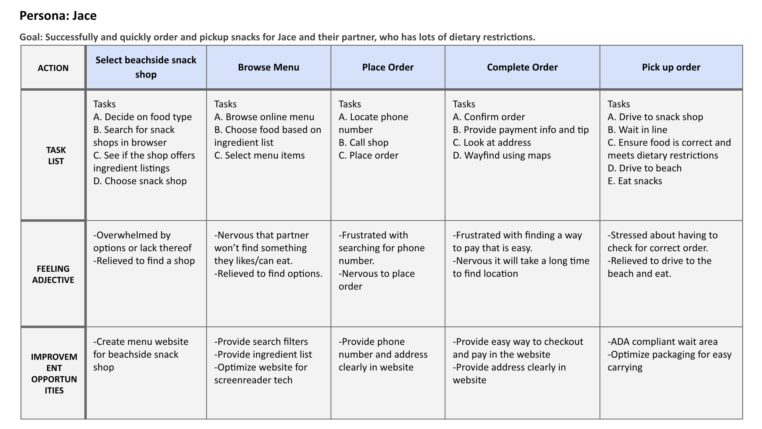
User Journey Map
I created a user journey that mimicked what a user like Jace would feel as they walked through the low fidelity prototype of my website. A user journey allows a user to complete tasks and express their feelings around how simple or difficult the user journey was.
Jace’s user journey helped me to understand how helpful it would be to have allergens listed clearly on a snack app for users.
Usability Study Findings
Round 1 findings
Accessibility
Need more accessibility options.
Typography
Headings need to be clarified.
Visual UI
Breaking up information into clearer sections would be helpful.
Process Flow
Checkout process needs to be simlified.
Navigation
Navigation is too complex.
Product Options
Too many product options can be overwhelming.
Round 2 findings
Mockups
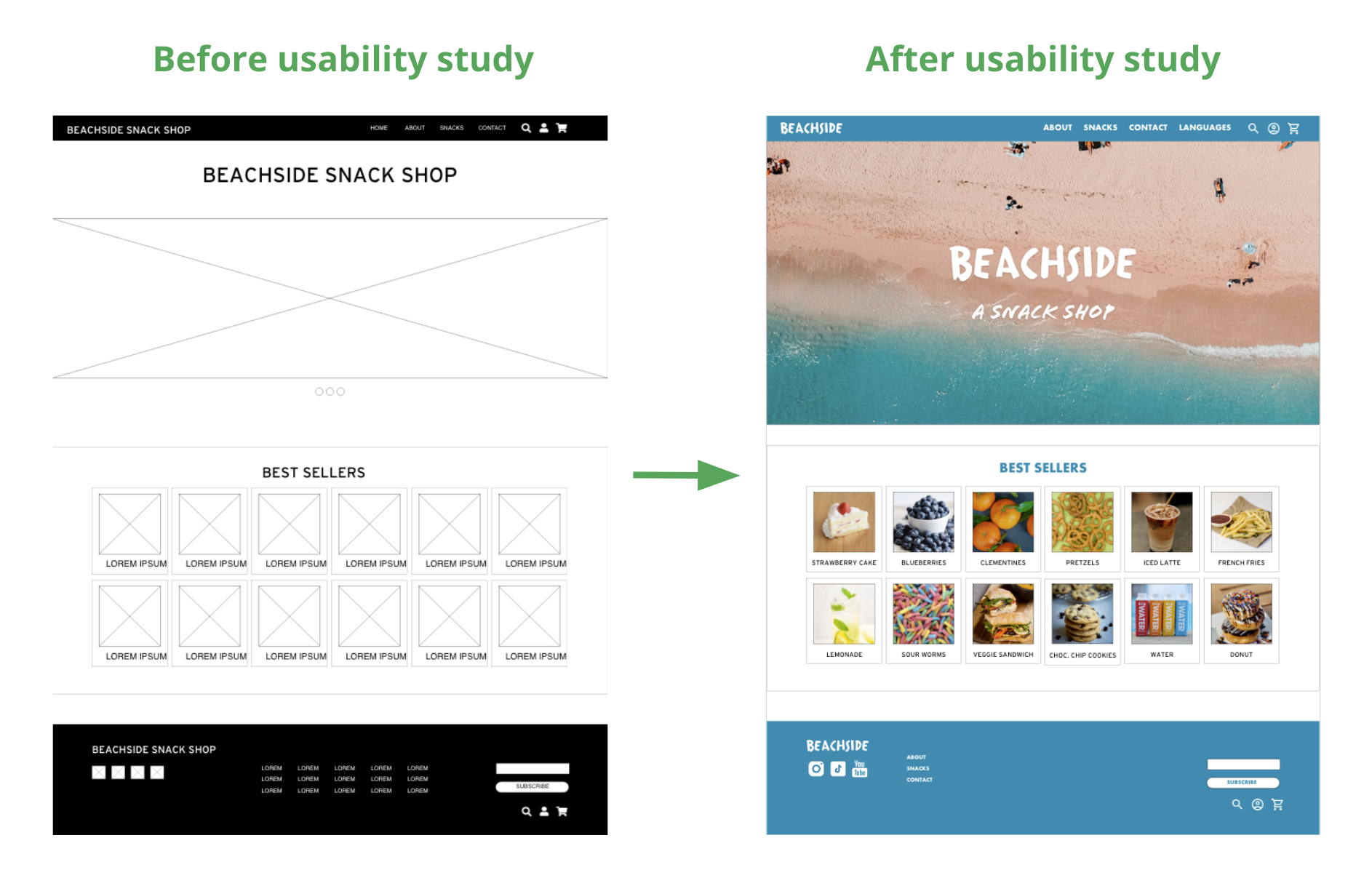
I took my design from rough digital low fidelity prototype to a more polished high fidelity prototype.
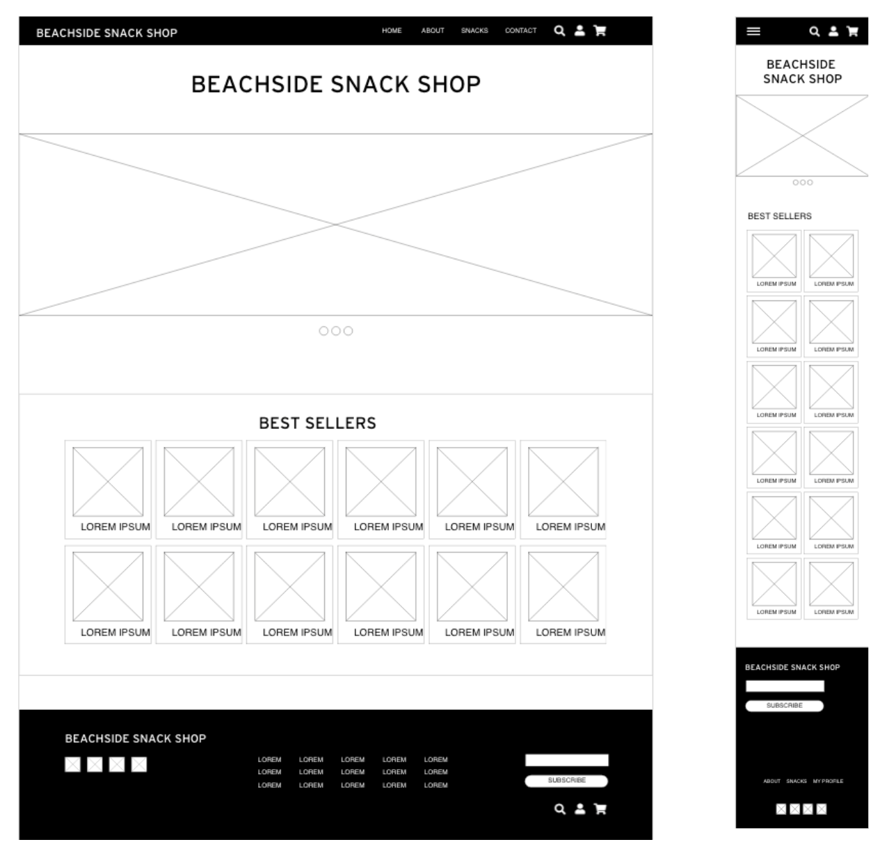
High Fidelity Prototypes
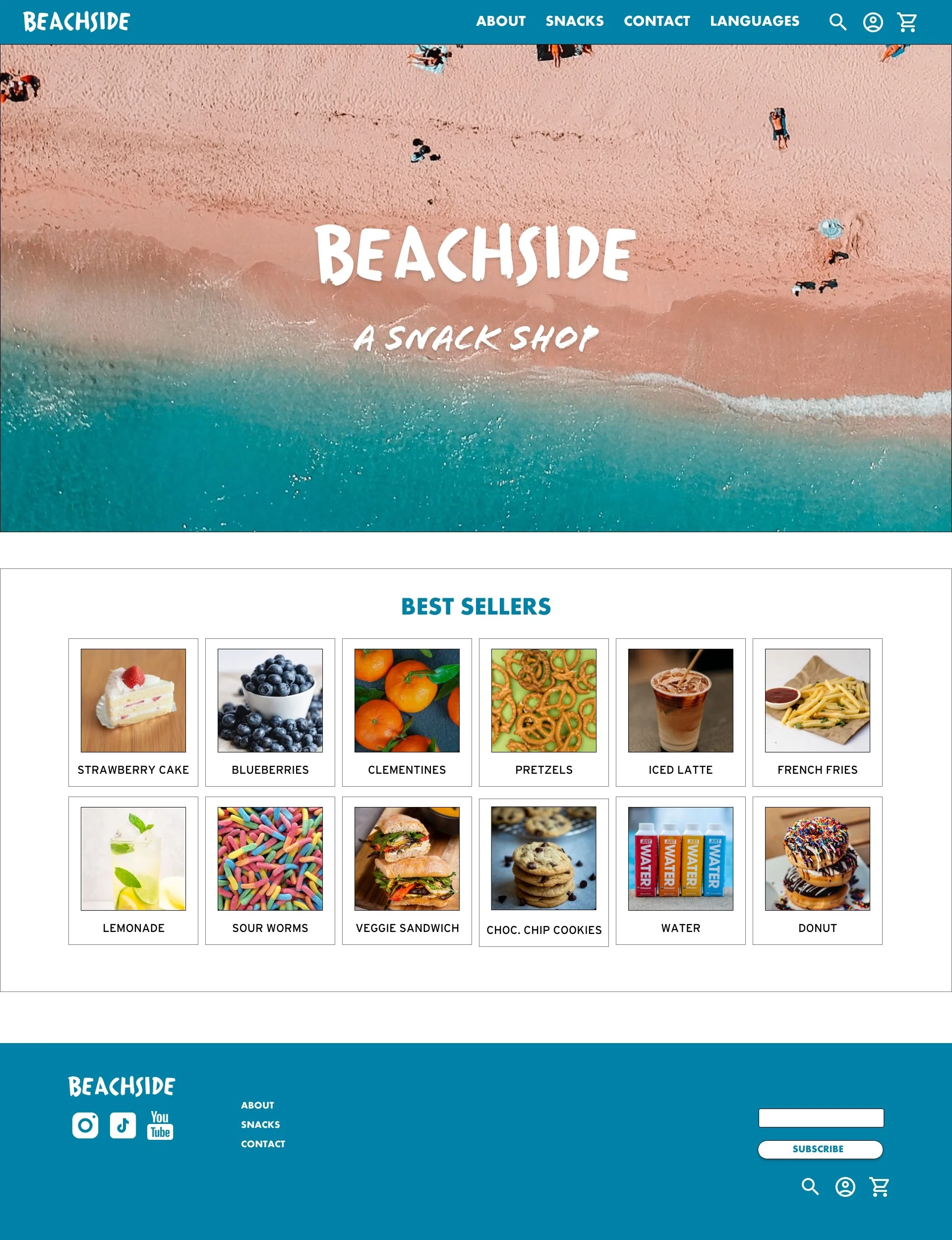
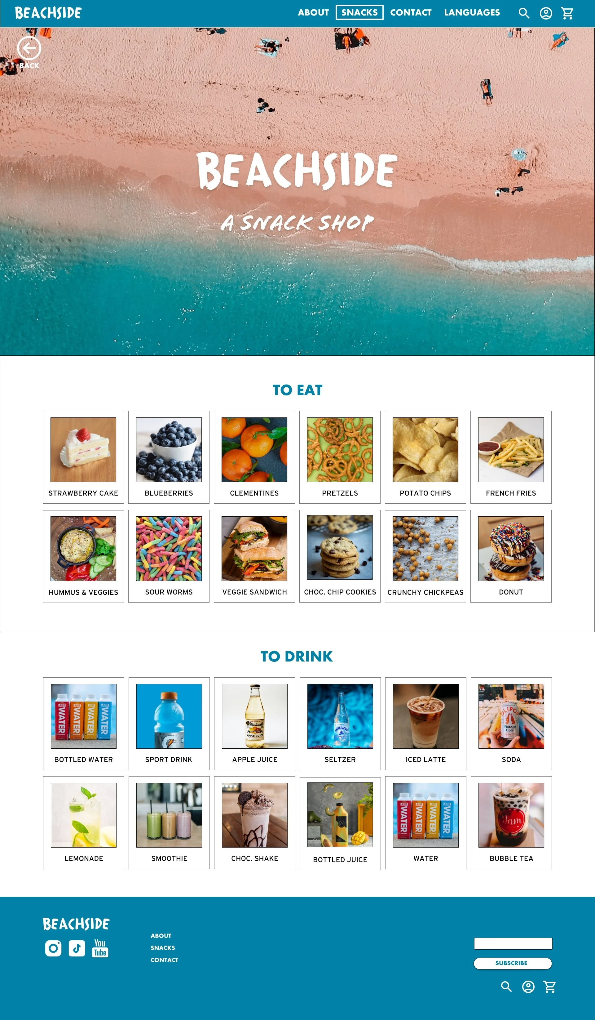
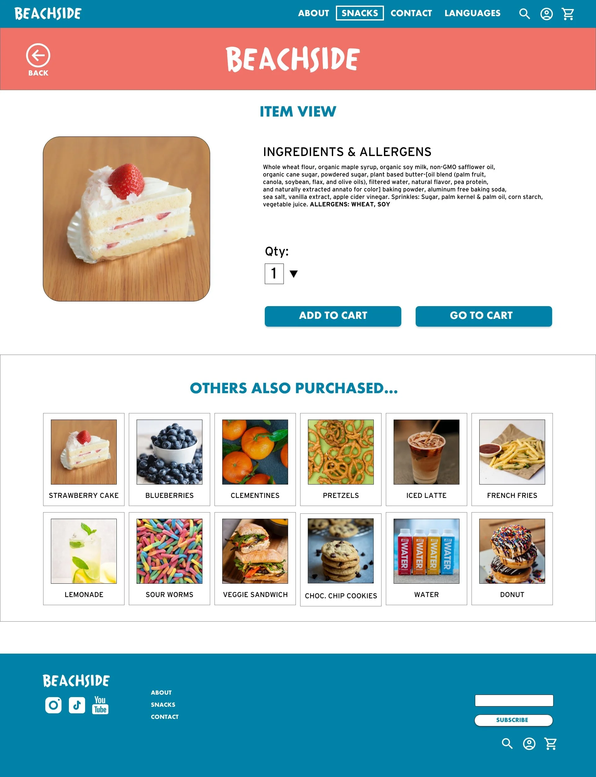
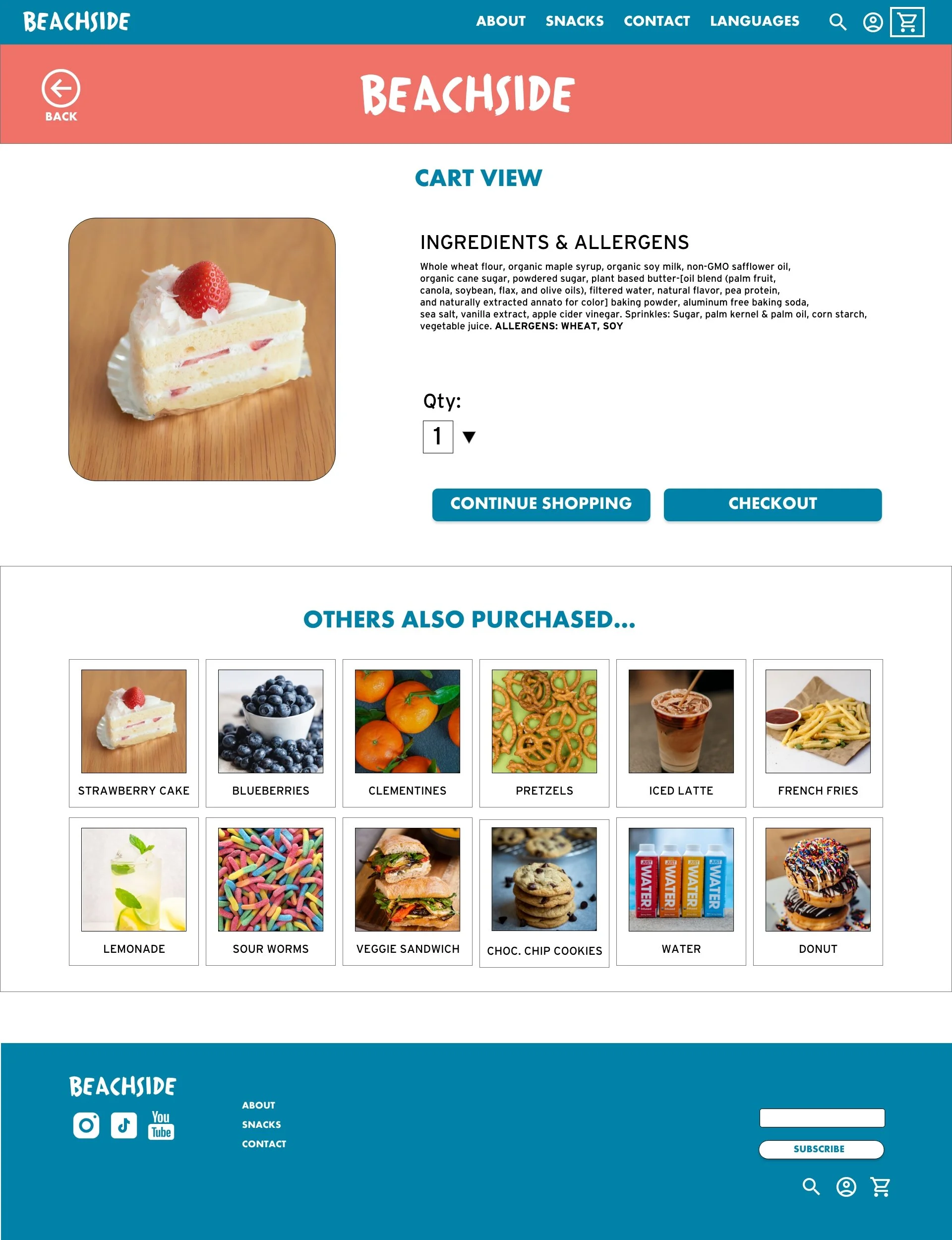
The final high-fidelity prototype was more complex but also more refined with clear user flows for ordering food. The website met user needs by providing allergen information up front.
Moving Forward
-
Accessibility takeaways based on study findings and the design process.
-
The most important things I learned during the design process.
-
Next steps in continuing to iterate on the design.
Accessibility Considerations
1
Color
Used high contrast colors so that all users can more easily view text.
2
Images and Words
Included pictures of items as well as icons so that the users not only had the text description, but a visual representation.
Language
Added a language option.
3
Takeaways

Impact:
The Beachside Snack Shop website meets user needs by removing the guesswork from ordering food online if the user has allergies or dietary restriction.
“I love it when ingredients are listed out clearly - it makes ordering food for my family so much easier!”

What I learned:
Each step of the design process is so important! Drawing insights from research and applying your insights to your final designs can make the website truly useful and accessible for all users. Even small changes in usability can make a huge impact!
Next Steps
1
Usability
Conduct another round of usability studies to see what can be further improved.
2
Accessibility Research
Do further research on accessibility needs and see how I can continue to improve in that area.
Refine
Further refine my design based on the previous steps.
3
© Emily Cloninger